View API Key Usage
Viewing API Key Usage
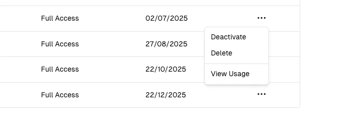
Section titled “Viewing API Key Usage”You can view the usage statistics for each of your API keys by clicking the ... of the specific API key, then selecting View Usage section.
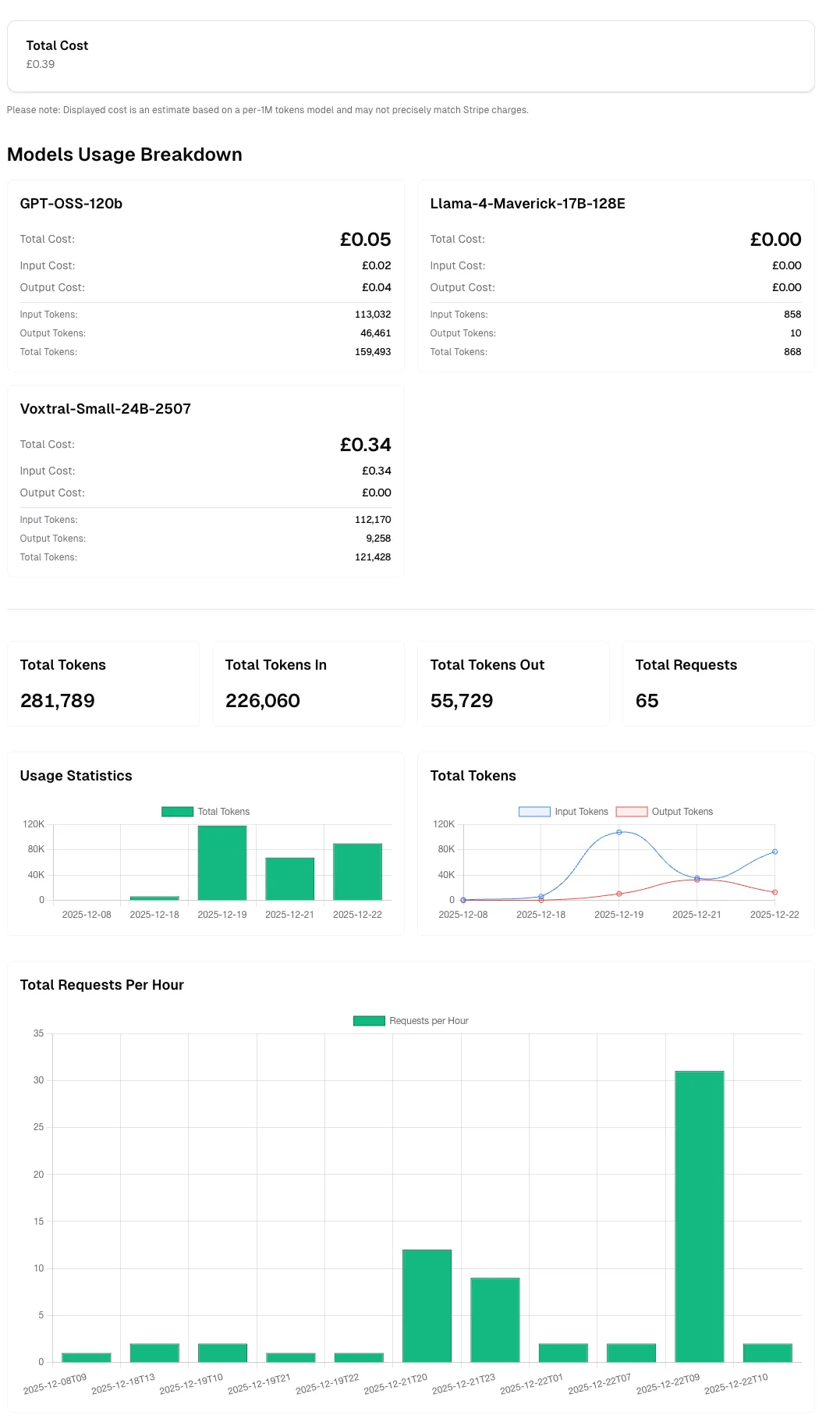
This takes you to a page showing you the Total Number of Tokens, Input Tokens, Output Tokens, Total Requests and Total Cost associated with that API key.
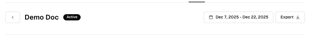
You can use the date picker to filter
the usage statistics by a specific date range, and you can also download a CSV report of the usage statistics by clicking the Export button.
Tokens Explained
Section titled “Tokens Explained”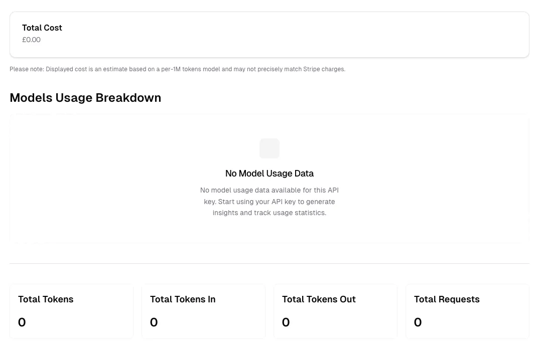
The API key usage dashboard provides detailed metrics to help you monitor and analyze your API consumption. Here’s what each metric represents:
Total Tokens
Section titled “Total Tokens”The combined sum of all tokens processed through this API key, including both input tokens (your prompts) and output tokens (model responses). This metric gives you a comprehensive view of your overall token usage.
Example: If you sent a prompt using 100 tokens and received a response of 200 tokens, your total tokens would be 300.
Total Tokens In
Section titled “Total Tokens In”The number of tokens used in your input requests to the API. This includes:
- Your prompts and questions
- System messages and instructions
- Context provided to the model
- Any additional input parameters
Input tokens are typically charged at a lower rate than output tokens. Optimizing your prompts to be concise can help reduce input token costs.
Total Tokens Out
Section titled “Total Tokens Out”The number of tokens generated by the model in responses. This includes:
- The model’s answers and generated content
- Completion text
- Any structured output from the model
Output tokens are usually charged at a higher rate than input tokens, as they require more computational resources to generate.
Total Requests
Section titled “Total Requests”The total number of API calls made using this API key during the selected time period. Each request counts as one call, regardless of the number of tokens processed.
Use cases for this metric:
- Monitor API usage patterns
- Identify peak usage times
- Track request volume for capacity planning
- Detect unusual activity or potential issues
Total Cost
Section titled “Total Cost”An estimated cost based on your token usage and the pricing model for each AI model you’ve used. This estimate is calculated using a per-1M tokens pricing model.
Cost calculation factors:
- Number of input tokens × input token rate
- Number of output tokens × output token rate
- Different models have different pricing tiers
- Pricing varies by model capability and size
Models Usage Breakdown
Section titled “Models Usage Breakdown”This section displays a detailed breakdown of your API usage by model. When you have usage data, you’ll see:
- Which models you’ve used
- Token consumption per model
- Cost breakdown per model
- Request distribution across models
When no usage data is available (as shown in the “No Model Usage Data” state), it means:
- The API key hasn’t been used yet, or
- No requests were made during the selected time period, or
- You’re viewing a newly created API key
Start making API requests with your key to populate this section with detailed usage insights and track statistics across different models.
Understanding Your Usage Patterns
Section titled “Understanding Your Usage Patterns”To get the most value from your usage statistics:
- Monitor regularly: Check your usage dashboard frequently to stay within budget
- Analyze trends: Use date range filters to identify usage patterns over time
- Optimize costs: Review which models consume the most tokens and consider using more cost-effective alternatives when appropriate
- Export data: Download CSV reports for detailed analysis or record-keeping
- Set alerts: Keep track of usage spikes that might indicate issues or opportunities for optimization
Best Practices
Section titled “Best Practices”- Review input/output ratios: A high output-to-input ratio might indicate verbose responses that could be optimized
- Track request efficiency: Low token counts per request might suggest inefficient API usage
- Monitor model selection: Ensure you’re using the most appropriate model for each task
- Regular audits: Periodically export and review usage data to identify optimization opportunities
Usage Visualizations
Section titled “Usage Visualizations”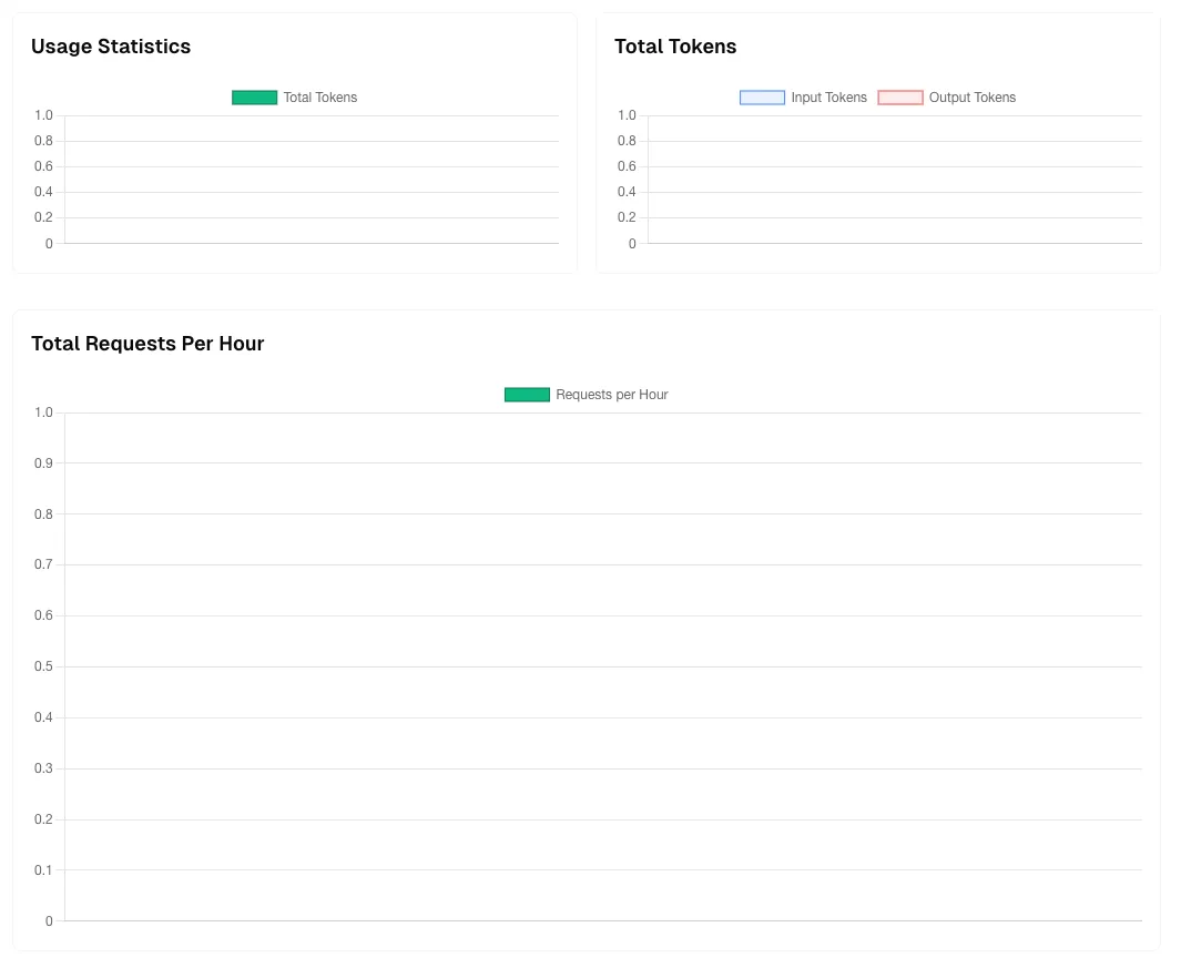
The usage dashboard provides three key visualizations to help you understand your API consumption patterns over time. These charts update based on your selected date range and provide insights into usage trends.
Usage Statistics Chart
Section titled “Usage Statistics Chart”This chart displays your Total Tokens consumption over time using a green bar graph. Each bar represents the aggregate token usage (both input and output combined) for a specific time period.
Key insights from this chart:
- Identify usage spikes: Easily spot periods of high activity
- Track growth trends: Monitor how your token consumption changes over time
- Baseline understanding: Establish normal usage patterns for your application
- Capacity planning: Predict future usage based on historical trends
How to interpret:
- Higher bars indicate periods with more API activity
- Consistent bar heights suggest steady, predictable usage
- Empty or low bars might indicate downtime or reduced application usage
- The Y-axis scale adjusts automatically based on your usage volume
Total Tokens Chart
Section titled “Total Tokens Chart”This dual-color chart breaks down your token usage into two distinct categories:
- Input Tokens (Blue): Tokens from your requests to the API
- Output Tokens (Red): Tokens generated by the model in responses
Why this breakdown matters:
- Cost optimization: Input and output tokens are often priced differently
- Efficiency analysis: Compare input vs. output ratios to understand response verbosity
- Prompt engineering: High input-to-output ratios might indicate inefficient prompts
- Model behavior: Track how much content the model generates relative to your requests
Optimal patterns to look for:
- Balanced usage: Proportional input and output for conversational applications
- High output ratio: Normal for content generation tasks (articles, code, documentation)
- High input ratio: Common when providing extensive context or multi-turn conversations
Total Requests Per Hour Chart
Section titled “Total Requests Per Hour Chart”This chart shows the volume of API requests distributed across hourly intervals, displayed as a green bar graph.
Key benefits:
- Peak time identification: See when your application experiences the highest traffic
- Load distribution: Understand request patterns throughout the day
- Performance monitoring: Detect unusual spikes that might indicate issues
- Rate limit planning: Ensure your usage stays within API rate limits
What to watch for:
- Consistent patterns: Regular hourly patterns indicate predictable application behavior
- Sudden spikes: May indicate viral content, bot activity, or application issues
- Off-hours activity: Unexpected requests during low-usage periods might need investigation
- Rate limit proximity: High request volumes approaching your plan limits
Using These Visualizations Together
Section titled “Using These Visualizations Together”Combine insights from all three charts for comprehensive usage analysis:
- Cross-reference patterns: Match token spikes with request volume increases
- Efficiency metrics: Calculate average tokens per request by comparing charts
- Cost forecasting: Use historical trends to predict future costs
- Anomaly detection: Identify unusual patterns across multiple dimensions
Example analysis:
- If Total Requests Per Hour shows a spike but Total Tokens remains low, you might have many lightweight requests
- If Total Tokens spikes but requests remain steady, you might be sending larger contexts or receiving longer responses
- Comparing Input vs. Output trends can reveal if you’re optimizing prompt efficiency over time
Time Range Selection
Section titled “Time Range Selection”All charts automatically adjust based on your selected date range:
- Short periods (hours/days): See granular, hour-by-hour patterns
- Medium periods (weeks): Identify daily patterns and weekly trends
- Long periods (months): Understand seasonal variations and growth trajectories
Use the date picker at the top of the page to analyze different time periods and export the corresponding data for offline analysis.
After Using the Usage Dashboard
Section titled “After Using the Usage Dashboard”This is how looks when you have usage data: